Why the colour looks different on screen
Short answer: The colour looks different because the screen setting, the light in the photo studio and the light in your living room are three separate things. Dark colours and muted tones come out best, bright colours worst.
Three steps that change the colour
The colour you see on screen has passed through several steps before it reaches you. Each step can shift it a little, and not necessarily in the same direction. That is why two people can look at the same picture and see the colour slightly differently. It is not a fault but a result of how images work.
The camera in the studio
The first step is the camera in the studio. The camera is set to the light in the room, and different light can make the same fabric look a little warmer or cooler in the picture. The photographer sets the camera so colours match reality as closely as possible, but they are rarely identical.
The editing of the image
The second step is the editing of the image. Pictures are often adjusted for light and contrast so they look clean, and that can shift a colour slightly. The adjustment is small, but it comes on top of the other steps, so several small differences add up in the end.
Your own screen
The third step is your own screen. Brightness, colour settings and night mode change how colours look. A phone in night mode looks warmer than a computer in daylight. Look at the same picture on two screens and you see the difference at once. It is not the picture that changed, but the screen.
Which colours are safest
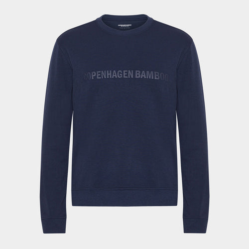
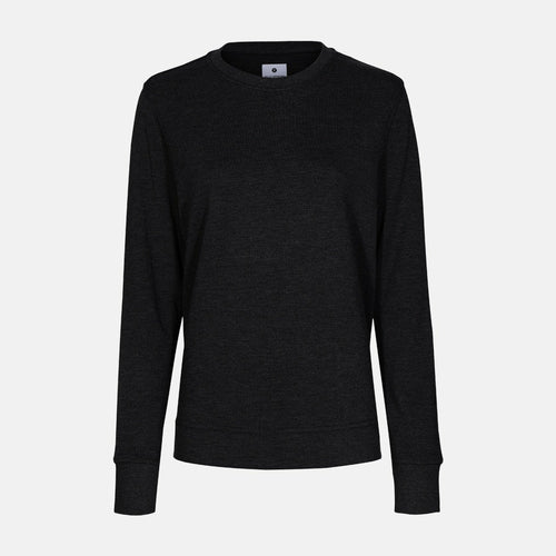
Black, navy, grey and white look about the same everywhere. Small shifts do not make a black T-shirt suddenly look red. White may look a little warmer or cooler but stays white. If you want to be sure the colour fits, neutral tones are the easiest route. See sweatwear.
Which colours are hardest
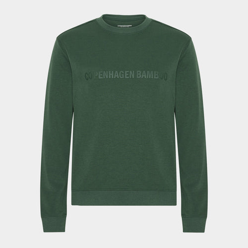
Red, orange and strong green are hardest. They often look more saturated on a screen than in the hand, because screens emit light while a piece of fabric only reflects it. A fabric can therefore seem more intense in the picture than when you hold it. See bamboo hoodies for women and bamboo sweatshirt for women.
The light in your home
The light in your home plays a part too. The colour does not look the same in daylight, under a warm bulb and under a cold fluorescent tube. A fabric in muted blue can look grey in weak light and clearly blue by the window. Judge the colour in daylight once the item has arrived.
How to check the colour
Look at the picture on both your phone and your computer. If the colours are close, the colour of the fabric is probably close too. If they differ a lot, it is a colour where the screen matters most, and a more muted tone is the wiser choice. Read the colour name too, because it tells you something.
If the colour disappoints
If the colour disappoints on arrival, you can return the item within the return period, as with any other purchase. That is a comfort, but it is still better to choose right the first time. Choose muted tones if you are unsure, and check the picture on two screens before you order.
Frequently asked questions
Can you do anything about it?
Look at the picture on both phone and computer. If they are close, the colour is probably close, and if they are far apart, choose a more muted tone.
Does it help to read the colour name?
A little. Names like dusty blue say more than plain blue, because they show whether the colour is muted or bright, and that is exactly what a picture can struggle to show.
Can you return it if the colour disappoints?
Yes, within the return period as with any other purchase. It is still better to choose right first time, so check the picture on two screens before ordering.
You can find the full range at Bamboo-Clothing.com.