Clothes for photography and colours that work
Short answer: Solid color, medium dark and matte works best on camera. Avoid fine patterns, very shiny fabrics and pure white close to the face, so the result stays calm to look at.
Why solid color works best
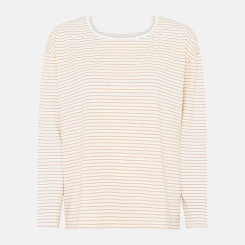
A camera resolves fine patterns poorly, and tight stripes or checks can create a flickering result that pulls attention away from the face. A solid surface is calm to look at and lets the face be the first thing the eye lands on in the image, both on screen and in print.
Medium dark over the extremes
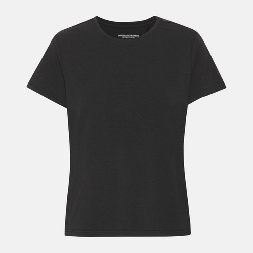
Pure white close to the face reflects light upward and can create harsh lighting under the chin and on the skin. Pure black, on the other hand, loses all detail in the fabric, so the cut disappears into shadow. A medium tone gives the best balance. See bamboo t-shirt for women in a calm, medium shade.
Matte over shiny
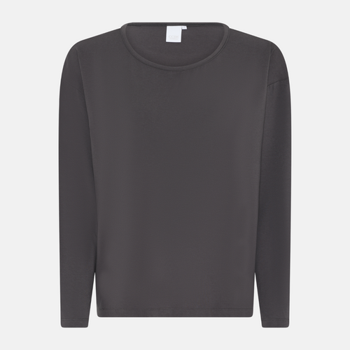
Shiny fabrics throw reflections from lamps and windows, and those reflections shift every time the person moves. Bamboo viscose has a light, natural sheen, so choose a matte quality or a muted color when the light is harsh. See bamboo clothing for women and bamboo clothing for men for calm, matte options.
The color should match the background
If the clothing color sits too close to the background, the person's outline disappears in the image and it becomes hard to separate subject from background. Choose instead a color with clear contrast against the room or outdoor setting the photo is taken in front of, so the figure stands out clearly.
Avoid prints and large logos
In portraits, prints and logos pull the eye away from the face, which should otherwise be what the image is about. A solid piece without text or pattern keeps the focus where it belongs. Save patterned favorites for images where the clothing itself is the main subject.
The direction of light matters
Side light brings out the texture of the fabric and makes a matte surface look more alive, while front light flattens everything no matter how matte the color is. When the person stands with light coming from an angle, even a simple color comes into its own and adds depth to the image.
Test the color on screen first
A color that looks calm in real life can shift tone on screen or in print, depending on white balance and light. Take a test shot before the actual session and view it on the same screen or device the image will be used on, so you avoid surprises afterward.
Several people in one image
When several people appear in the same image, it helps to keep the colors within the same muted family without matching exactly. See bamboo clothing for women and bamboo clothing for men for base colors that work together without being identical.
Avoid very new or very worn fabric
A brand new piece can have sharp creases from packaging, while a heavily worn piece shows pilling and small holes clearly in a sharp image. A piece that has been washed a few times and still holds its shape usually gives the smoothest result in close up shots.
Frequently asked questions
Is black bad in photos
Not bad, but it often becomes a flat surface without structure, because the camera struggles to capture the detail in the dark fabric.
What about colors that match the background
Avoid them. If the clothing color sits close to the background, the body's outline disappears, making it hard to separate the person from the background.
Should prints and logos be avoided
In portraits, yes. They pull the eye away from the face, which should otherwise be the focus of the image and the first thing noticed.
You can find the full range at Bamboo-Clothing.com.